
Tabs
Tabs allow extensions to add additional tabs to existing Administration pages.
They are commonly used to extend entity detail pages such as products, customers, or orders.
addTabItem()
Add a new tab item to an existing tab bar. The content of the new tab item contains a component section. This works with tab bar's which have routing and also static tab bars. If the tab bar has routing then the route for the tab item will be generated automatically.
Usage
ts
import { ui } from '@shopware-ag/meteor-admin-sdk';

ui.tabs('sw-product-detail' /* The positionId of the tab bar*/).addTabItem({
    label: 'Example tab',
    componentSectionId: 'example-product-detail-tab-content'
})
Parameters
| Name | Required | Default | Description |
|---|---|---|---|
label | true | The label of the tab bar item | |
componentSectionId | true | The Id for for the component section in the tab content | |
visible | false | true | Whether the tab item is shown initially. Set to false to register it hidden; use setVisibility() to change it afterwards. |
Return value
Returns a promise without data.
Example
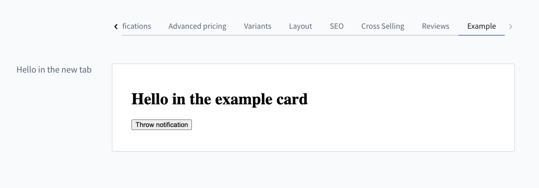
ts
import { location, notification, ui } from '@shopware-ag/meteor-admin-sdk';

// For general commands
if (location.is(location.MAIN_HIDDEN)) {
    // Add tab bar item
    ui.tabs('sw-product-detail').addTabItem({
        label: 'Example',
        componentSectionId: 'my-awesome-app-example-product-view'
    })

    // Add component to the new created section
    ui.componentSection.add({
        component: 'card',
        positionId: 'my-awesome-app-example-product-view',
        props: {
            title: 'Hello in the new tab',
            locationId: 'my-example-product-view-tab-card'
        }
    })
}

// Render custom view of the component
if (location.is('my-example-product-view-tab-card')) {
    document.body.innerHTML = `
        <h1>Hello in the example card</h1>
        <button id="show-notification">Throw notification</button>
    `;

    document
        .getElementById('show-notification')
        ?.addEventListener('click', () => {
            notification.dispatch({
                title: 'Foo',
                message: 'bar',
            });
        });
}
setVisibility()
Show or hide a tab item that was previously added with addTabItem(). Use this to toggle a tab's visibility for the current context (for example, based on the entity that is currently opened), instead of calling addTabItem() again.
Usage
ts
import { ui } from '@shopware-ag/meteor-admin-sdk';

ui.tabs('sw-order-detail').setVisibility({
    componentSectionId: 'example-order-detail-tab-content',
    visible: false,
});
Parameters
| Name | Required | Default | Description |
|---|---|---|---|
componentSectionId | true | The componentSectionId of the tab item to show or hide | |
visible | true | Whether the tab item should be shown |
Return value
Returns a promise without data.
